
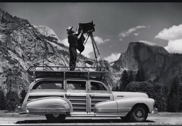
I really adore this image, because almost everything was set to make a perfect image: the angles and symmetry, focal point, contrast of colors. In this image at the Half Dome, where Ansel Adams is standing perfectly straight to take a photo on top of his car, there are many places in this image where symmetry is being portrayed. Symmetry can be seen from the leg of the camera stand closest to Adams compared to the 45-degree slant of Half Dome, the curve on the front of his car to the curved part of Half Dome, and the same leg to the back of the car sharing the same 45-degree angle. The highlight of the image to me is around his head, the camera, and his jacket. I believe this is because those are roughly in the center of the photograph and also where there is the most contrast of colors. The white clouds, which are the brightest part of the image, are right where the camera and jacket are, which are both the darkest parts. Another focal point for me is the trees just above the car hood. There are roughly five or six trees. For some reason, my eye is naturally drawn to darker points. The texture of the trees is what also lured my eyes there. Not only are they in a bunch, but they also have a crispy or rough texture to them, unlike the smooth texture of the car.
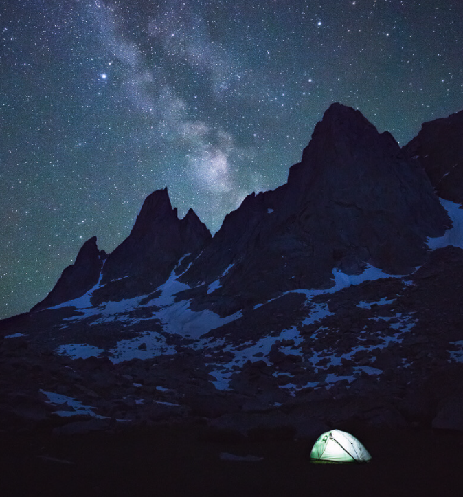
When I first glanced at this image, my immediate thought was: this must be made from artificial intelligence, until I realized that I was doing a Mr. Watt document. The beautiful starry night sky is filled with different colors, but in the middle of it, at a 135-degree angle, there is a streak of pink stars amidst the dominant dark blue night sky. The pink stars seem to slowly become fewer in quantity the higher they reach in the sky; starting with a lot near where the mountains are shown but fewer the further northwest they go. It is safe to say that the stars would be the vanishing point of the image, because of how far away they are. When an image is dominantly bright, the focal point will be the darkest, and the opposite can be said for a dominantly dark photo, so my focal point was naturally the bright tent. Despite the tent not being in the middle of the image, the brightness alone is enough to draw my eye to it first. For it is just such a bright point in an image that is so dark. Now, the final major part of the image: the mountains. The mountains are so nice, not just because of the contrast of the snow on them to the dark rocky parts of it, but because of the texture. The rough texture that the mountain holds is so beautiful, bringing contrast to the night sky and even more to the completely smooth tent. There can also be seen symmetry between the tent and the peaks of the mountain, forming a triangular shape.
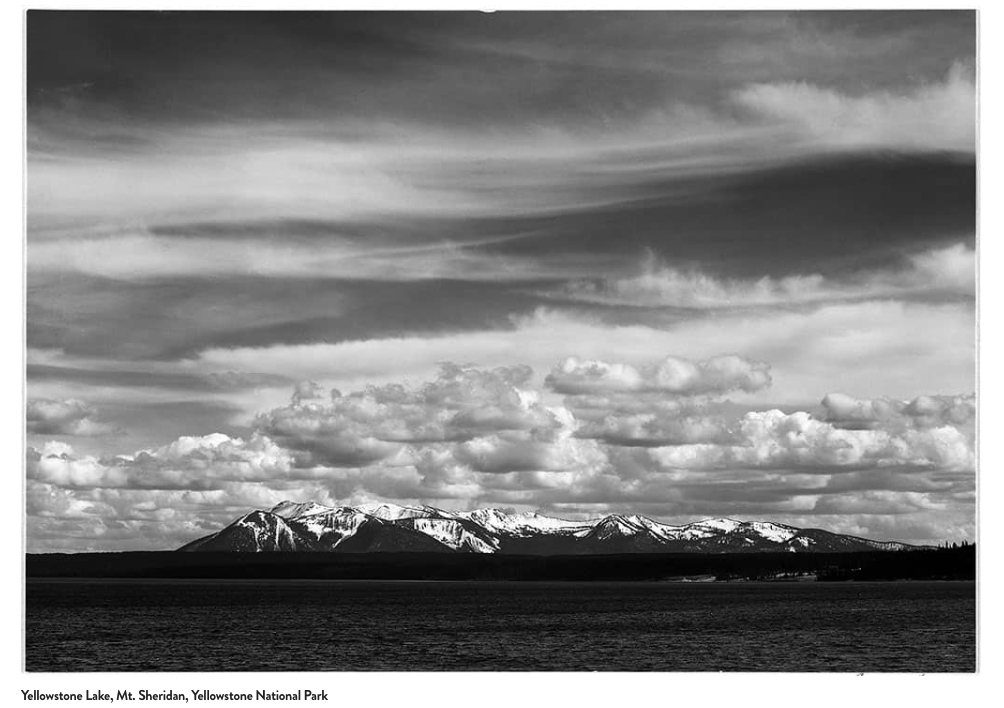
This image tricked me at first, because I thought the part in front of Mt. Sheridan was just regular land, until I realized it was actually a body of water, and after looking even closer, I realized it was Yellowstone Lake. The depth of field being portrayed in this image is of such a large quantity, because it covers not only the entire Mt. Sheridan, but also the smooth sky and Yellowstone Lake. Despite it being a black-and-white photo, we can almost visualize what it would look like with darker clouds up top, whiter clouds above Mt. Sheridan, and a nice blue lake in front of Mt. Sheridan. My favorite part of the image is the different types of texture: the rocky or rough texture from Mt. Sheridan, the substantial amount of ripples in the Yellow Lake, and even in the clouds there are different textures. The clouds on the top of the image are more spread out and smooth, but the clouds above Mt. Sheridan are much fluffier and almost squishy. It is very interesting to me that Bresson chose to put Mt. Sheridan in the middle of the image, but not the center. The clouds taking up three-fourths of the image really confused me, because I would’ve thought that he would want either Yellowstone Lake or Mt. Sheridan takes most of the photo. After all, they are the main event of the image.
Could I become a photojournalist?
Weegee versus the paparazzi
It is very interesting to me that Weegee experimented with different types of ways to take photos, whether it be him manipulating copy negatives by placing them in boiling water, putting a kaleidoscope to the end of the camera lens, or placing a textured or curved glass between the enlarger lens and the photographic paper. All of these different methods he would experiment with were what made Weegee so unique and ahead of his time. Weegee was known for his work on crime scenes or emergencies to show the stories behind the photos he would take. I think that photojournalism is a way to tell a story through photos. They must be photos with minimal to no editing, as that might taint the photo and even the story behind it. The boundaries between photojournalism and paparazzi are very blatant to me. Paparazzi is when there’s an excessive need to get attention, often bending the story to gain more traction, but photojournalism is about sharing photos without bias so people can understand the story without anyone trying to shift their beliefs. I can see myself partaking in photojournalism because it is actually something very simple, but I don’t see myself participating in more controversial scenes like crimes, but more so nature. For instance, I can see going on an assignment to the Gereat Wall of China and taking images of the joists and corners, revealing the expert handiwork required for such a wall. Sloppy or disrespectful photographs can cause massive amounts of damage to true human stories by misleading the true meaning or tale behind the photograph. Instead of using sloppy photography, those viewing it would get a twisted version of a story. Weegee does a nice job of preserving human dignity in his photographs; because of his photos, we are able to see the clear story that was being portrayed, keeping the true human stories told.